
Artist Researcher Program (ARx4) Now Exhibiting
It’s been a long, rewarding year as a member of the fourth cohort for the Artist + Researcher Program. The program pairs local artists with researchers and scientists from Arizona State University, Northern Arizona University, The University of Arizona College of Medicine – Phoenix, the Translational Genomics Research Institute (TGen), and Phoenix Biosceience Core-based (PBC) life sciences companies.
First, I want to thank the PBC Arts Committee for creating the program and providing this opportunity! I was paired with Dr. Tim Lant, Director of Data Analytics and Coordination at the Health Observatory, Arizona State University. I’ve learned so much about Tim, his team and the work they undertake to keep Arizonans healthy. He has my unending gratitude for sharing his knowledge and contributing his work to this art project.
MATH
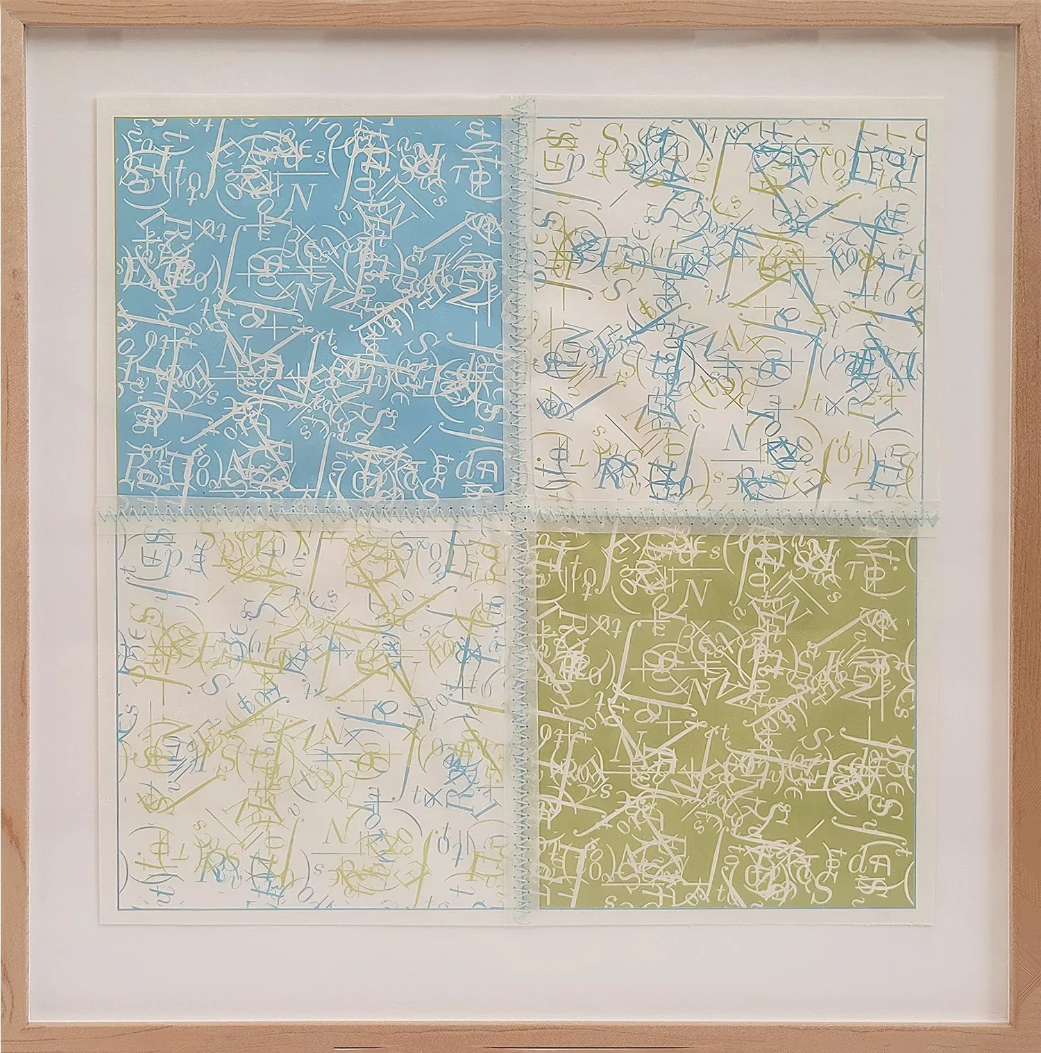
Early on, we met several times to get to know each other as people. I was able to tour his offices, and he visited my home studio in New River. During that visit, he brought the bound copy of his Doctoral dissertation. I saw page after page of equations. It was like trying to read a foreign language. What stuck out to me was the graphic beauty of the mathematical symbols and their considered placement in relationship to each other. It was clear Tim had a passion for math and a keen appreciation of the beauty on these pages. He started his college career as a fine art painter, but loves to say that he switched to something much easier - math!
Tim and his team use math (equations like these) to find and interpret patterns in health data. Imagine data like hospitalizations or viruses found in waste water. Imagine too that this important data is challenging to find amid governmental regulations, protections and various levels of security protocol. Or imagine a researcher heading out to a local recharge pond to retrieve any dead water fowl to check for the presence of H5N1 (bird flu).
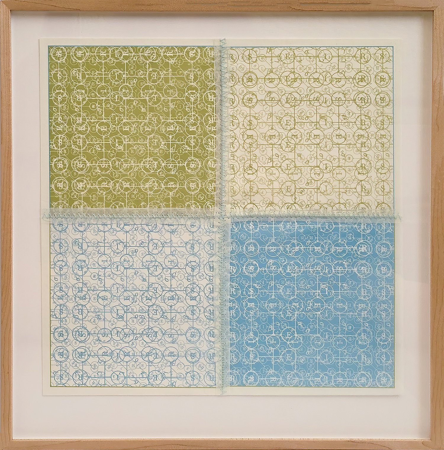
We payed special homage to the Tim’s equations making patterns from the the very thing that is used to detect patterns. Here, stitched together as quilt squares. Quilting was historically a community activity and speaks to the community Tim and his team serve. (Special thanks to Villa Custom Framing for the beautiful maple frames with splines created for all the posters.)
[The equation is a standard compartmental model where S is the susceptible population, E represents newly exposed, I is the infected population, and R is the recovered population. Iv represents the vaccinated population.]
DATA
We talked about many ideas for conveying what he does. References to math and data would certainly be a part of the art. To that end, you’ll see Tim’s equations from his dissertation all the way up to equations he uses today. A bit of an equation career retrospective.
I found myself thinking about the human side of the math and data. The human reseachers and the the human beneficiaries of the research. Tim was so patient as I asked question after question (the same question multiple times I’m sure!) I’d email or text about something I’d read in the news and he’d send me information about the topic. From a PDF of one of Tim’s professional presentations, I learned that the math can also be shown as graphs and models. Their graphic nature was appealing to me too and a lose interpretation of one of those complex models made its way into the art.
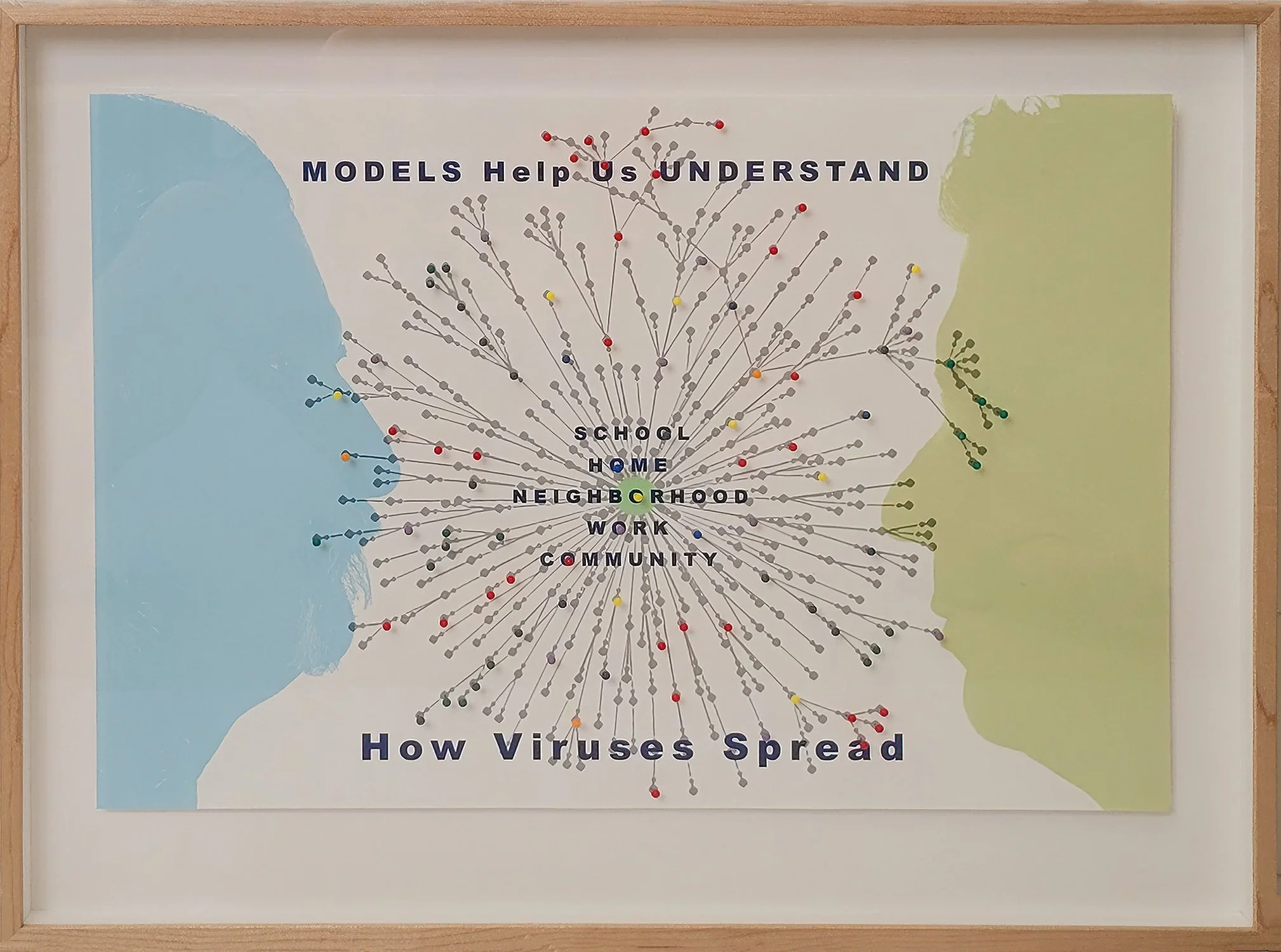
Silhouettes of Tim Lant and Dave Engelthaler, Executive Director of the Health Observatory at ASU and a Professor and the Director of TGen North, the infectious disease branch of the Translational Genomics Research Institute. The model in the center is a simplified interpretation of the one Tim created after H5N1. That original model showed more detail (age groups and source of transmission). Here it looks a bit like a virus making its way toward eyes, nose and mouth.
SILHOUETTES and PORTRAITS
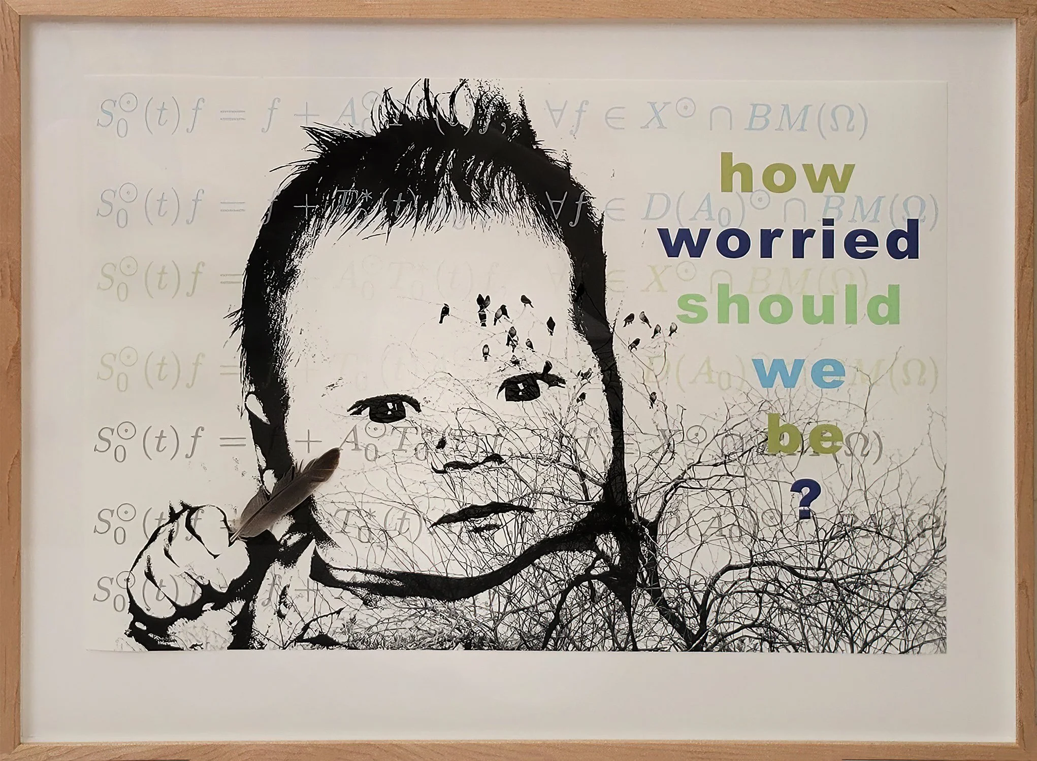
I was able to meet with team members on one of my visits to his office. They also provided input on the artwork. It was important to them to bring in the ideas of Arizona and the communities they serve. It was a moving experience that generated my desire for doing portraits. All were gracious enough to allow me to photograph them and then interpret those images as sketches and silhouettes. Initially, I thought about how these folks work in relative anonymity. (The silhouette profiles of Tim and Dave reflect this idea.) It became a heart desire to change that anonymity and give them a bit of public gratitude. (The other portraits you’ll see in the art.) The infant portrait is important too as she represents the vulnerability and innocence we carry as non-scientists. The little one is my great niece, now five years old, who was born only a few months before the Covid lock-downs.


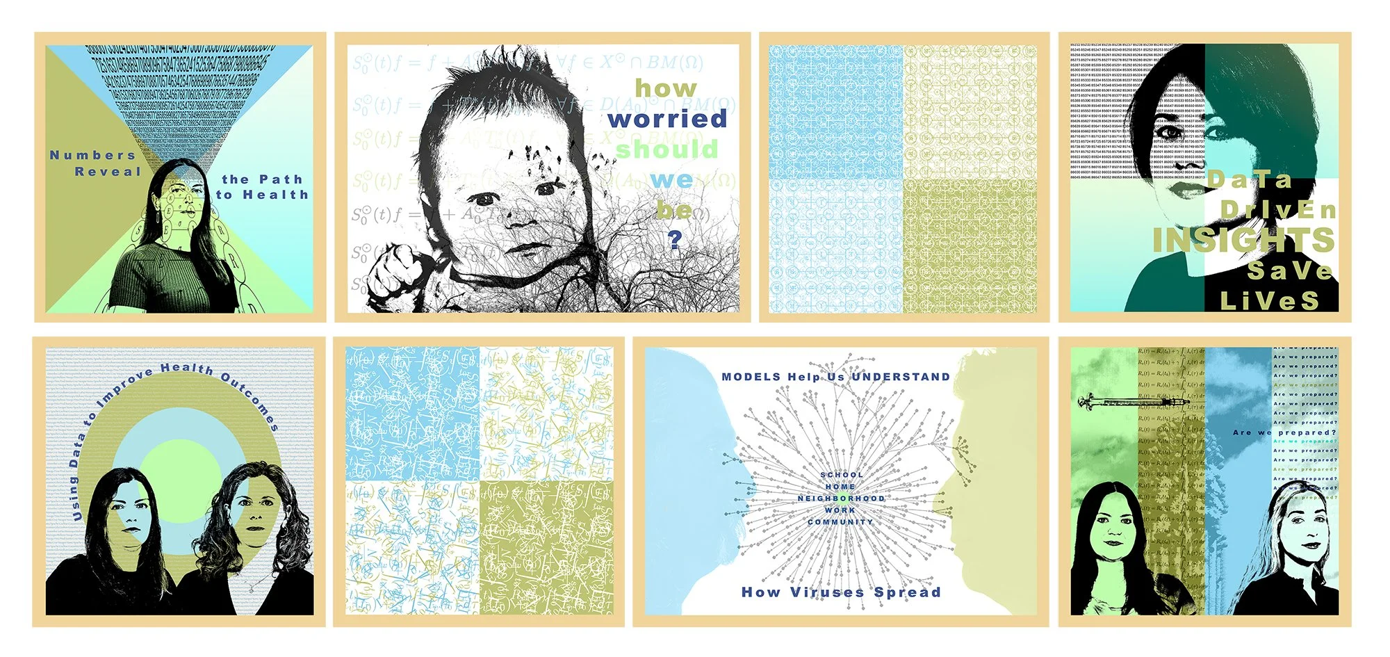
One of those concerning questions, comforting team portraits, the essential equation element, and the quintessential Arizona saguaro.
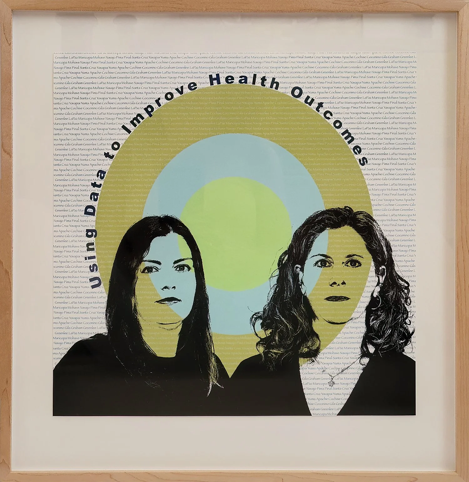
The posters use reference to Arizona through zip codes, county names, images of Arizona plants and birds. Each portrait poster has its own geometric shape that also speaks to the idea of patterns.
TEXT
The story behind the text portion of the artwork is interesting. I wanted to use questions at first. Questions like “How worried should we be?” and “Are we prepared?” We talked about the questions at one of our coffee meet-ups and how it was affecting the tone of the art. This was a lot of serious stuff. Covid, bird flu, infections spreading, worry about what new pandemic might come next. Tim felt we shouldn’t shy totally away from the “dark side,” but should embrace the full spectrum of life and their research. To balance out, I asked him to write headlines he’d most like to read in a news article. His headlines mirror his personality - science oriented and positive. The text element for the artwork now seemed complete.
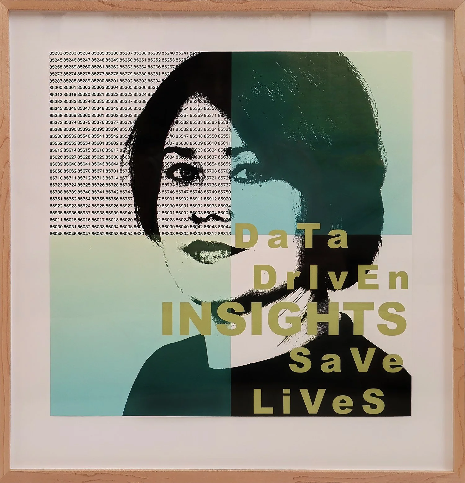
One of Tim’s headline texts paired with team portrait and Arizona zip codes to represent data.
PROCESS and INSPIRATION
“Posters have been a vital means of communication, and a familiar feature of our public spaces since the 19th century. Whether promoting products and services, exhibitions and performances, political causes or protests, they are compelling visual evidence of our social and cultural history.” — Victoria and Albert Museum
My visual inspiration came from the rich history of poster art that covers subject matter from advertising to political protest. For these posters there are three elements: equations and data, text, and portraits. The installation comes together in eight separate pieces that speak in simple terms to the stories and ideas surrounding the complex research into health science being done at Arizona State University. The posters are printed with archival pigmented inks and bits of watercolor. They are visual representations of Tim, the team he always nudged forward into the spotlight, the rudiments of their work, and the community they serve. The retro palette consists of two shade of blue (representing trust) and two shades of green (representing renewal).
If you take anything away from the artwork, I hope it is that the silhouettes and portraits represent talented, dedicated, knowledgeable people in the Arizona scientific community. They are our neighbors, friends, and family. They apply math and science, the tools they’ve learned through years of committed study, to find patterns in hopes of answering the questions that make us healthier.
Layout of the posters for installation at Arizona Science Center in November 2025